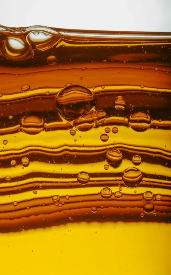
The first time I tried amber liquid macro photography, I ended up with a murky brown mess that looked more like a forgotten jar of old honey than the warm golden shot I had in my head. You’re probably here because you saw that dreamy fall color palette in someone’s oil droplet photo and thought, I want to make that. The good news is this is totally achievable. The bad news is everyone makes the same five or six mistakes before they figure it out.
That amber liquid macro shot that gives you all the fall feels, the one with layered orange tones and tiny bubbles floating like they’re suspended in honey, it isn’t luck. It’s about working with light, viscosity, and a bit of patience. I’ve spent more hours than I’d like to admit chasing that cozy autumn vibe through a macro lens. Here are the exact mistakes I made so you don’t have to.
Mistake 1: Using the Wrong Kind of Liquid for the Shot
Look, not all amber liquids behave the same way, and this is where most people go wrong on their first attempt. Plain water with food coloring will give you sad, flat results because it’s too thin and the color settles unevenly. The magic you see in those warm golden macro shots comes from viscosity.
You need something thick enough to suspend bubbles and oil droplets in place. Honestly, vegetable oil with a few drops of amber food coloring works okay, but it’s not great. A mix of corn syrup and a tiny bit of warm water gives you that honey-like body that holds texture. It moves slower, which means you can actually compose the shot instead of chasing liquid around the dish.
I’ve also used old pancake syrup straight from the bottle in a pinch. It worked. It was sticky and annoying to clean, but the results had that authentic fall color palette without any extra coloring.
Mistake 2: Fighting the Light Instead of Using It
The biggest reason amber liquid photography fails is harsh, direct lighting. When you put a hard light source straight over a translucent liquid, you blow out all the warm golden detail and turn the droplet edges into stark white lines. That’s not cozy autumn vibes, that’s a glare spooky specter.
Here’s the thing that actually changed my results: diffused backlighting. I placed a small LED panel behind the liquid container and put a piece of white parchment paper between the light and the subject. That single move transformed everything. The light passed through the amber tones and created that warm golden glow from within, rather than reflecting off the surface.
The fall colors in your final image depend on this. If you can’t control the light, you can’t control the color. It’s really that simple.
Mistake 3: Chasing Big Bubbles Instead of Small Ones
A common pitfall in macro photography is thinking bigger bubbles make a more dramatic image. They don’t. Large bubbles just reflect the light source and create distracting highlights that pull your eye away from what matters. The tiny bubbles, the ones that form a delicate population throughout the liquid, that’s where the visual texture lives.
When you see those layered orange tones in an amber liquid macro shot, it’s usually because small bubbles create organic striations and marbled patterns as they sit suspended in the syrup or oil. These distinct horizontal striations are one of the most beautiful accidents in this type of photography.
To encourage small bubbles, you can stir the liquid with a toothpick right before you shoot or let it settle for a few minutes after pouring. If you need to add bubbles on purpose, use a small pipette to release just a drop of air below the surface. That technique gave me the floating suspended look I’d been chasing for weeks.
Mistake 4: Overlooking the Depth of Field Sweet Spot
Here’s where the common mistakes in macro photography get technical. Shooting wide open at f/2.8 gives you that dreamy blurred background, but it can also blur the entire subject when the liquid is too thick. There’s a narrow line between aesthetically soft and frustratingly shapeless.
From my experience, f/5.6 is the sweet spot for most amber liquid work. You want the foreground bubbles and the main body of the liquid sharp, but the deeper layers should fall into soft abstraction. That shallow depth of field effect, the one that creates the cozy fall color palette against a blurred backdrop, only works if you keep the focus plane intentional.
Put your camera on a tripod. I can’t stress this enough. The combination of slow shutter speeds and manual focus is unforgiving when you’re working without a stable base. I wasted an entire session shooting handheld and ended up with two usable frames out of nearly a hundred.
Mistake 5: Neglecting the Background Colors Entirely
The warm golden texture you’re after doesn’t come from the liquid alone. For whatever reason, this is the mistake that people discover last. The amber liquid is your hero subject, but the background sets the emotional tone of the entire composition.
For fall colors specifically, a deep burgundy or muted forest green background makes the amber tones absolutely glow. I learned this one by accident when I left a red tablecloth behind my setup and watched the colors interact beautifully. The orange and amber layers suddenly had depth because they were playing against a contrasting hue.
You can test this quickly. Shoot the same liquid setup against a neutral white background and a deep jewel tone background. The difference is immediate. The white works for a clean product shot, but it completely kills the autumn vibes that make these images feel like seasonal wallpaper material.
Mistake 6: Collecting the Shots Without Editing the Temperature
You can do everything right in-camera and still end up with images that look cold and uninviting. That’s because whatever glowing magic you saw through the viewfinder can shift when the file opens in your editing software. I edit my amber liquid photos with a slight warmth boost. Not a crunchy Instagram filter, just a subtle bump in the temperature slider.
The key here is to preserve the natural amber tones without tipping into artificial orange. The fall color palette you want should feel organic, like sunlight trapped in a jar. I usually nudge the white balance toward yellow or amber by about 300 to 500 Kelvin, then reduce highlights and increase the clarity on the sharp bubbles only.
If your editing software lets you mask specific areas, use it. Sharpen the bubbles in the foreground and leave the background soft. To get those cozy autumn vibes, using a split tone with warm highlights and neutral shadows creates a genuinely warm golden result without an overly heavy edit.
If you want the final image to have that suspended in honey feel, you need to preserve the luminance. Don’t darken the shadows too much. The translucent quality of the liquid is what sells the shot, and that comes through only when the backlight can pass through your edits.
Mistake 7: Ignoring the Practical Setup Details
The unglamorous side of macro photography is the setup. You could have the most perfect amber liquid imaginable, but a rushed setup will ruin it. The container glass needs to be absolutely spotless. I’m not kidding, I’ve spent a full hour in Lightroom healing out dust spots that were invisible to my naked eye but monstrous at 1:1 magnification.
When you’re photographing marbled patterns within the liquid, think about the container shape too. A flat-sided glass dish works better than a curved bowl, because the curve introduces an unwanted lensing effect that distorts the bubbles and striations. Honestly, a thin glass petri dish is ideal. It lets you get close without the edges interfering with the composition.
Another practical detail, the temperature of the liquid actually matters. Warm syrup or oil moves more freely and allows bubbles to rise slowly and hang suspended, while cold syrup stays clumped and creates weird density separations. I microwaved my corn syrup mixture for about ten seconds before pouring it, and the texture changed completely. Those tiny bubbles floating throughout the liquid in the reference photo are the exact result of getting this right.
Some Equipment That Actually Helped Me
For this type of warm golden macro work, a dedicated macro lens makes life easier, but extension tubes on a standard 50mm kit lens can get you there too. This second option is cheaper, and you can run it perfectly fine. Here’s what I keep on hand for amber liquid shoots:
– A small LED panel with a diffuser sheet for that backlight effect
– A glass petri dish or flat-bottomed clear container
– A tripod or trusty clamp for stability, since your shutter speed will be slow
– A pipette for controlled bubble placement
– An amber food coloring set or a tiny brush to add gel tints to the backlight
The more you shoot, the more you’ll figure out what works best. But please, save yourself the heartache and test your full setup before you pour anything.
The vertical composition works wonders for fall wallpapers, by the way. Most people shoot horizontal by default, but the way the striations stack in an amber liquid macro photo makes it a natural fit for a portrait orientation. Just a thought if you’re planning to use these for seasonal mood boards.
This whole process, the layering, the light, the bubbles slowly drifting, it’s honestly relaxing once you get past the frustrating part. There’s something satisfying about watching a translucent amber drop catch the light and hang there like a small piece of autumn.
So grab whatever setup you can piece together, make a few of the mistakes I listed, fix them, and shoot this on the next cloudy afternoon when you need a little warm golden desk escape. I’d love to know which mistake hit closest to home for you or if you have your own trick for getting those fall colors to pop in liquid photography. Drop it in the comments.
Leave a Comment